Showing posts with label JMW Turner. Show all posts

Tuesday, September 15, 2015

FInished, sent to the mail, etc!

Just a quick note to say that I very happily mailed off the lovely painting to where it will hopefully be received with joy and glee!

It went to the coast, so I imagine that it went to a place like this:
"Sunrise at Carolina Beach, North Carolina" by Bigroger27509 - Own work. Licensed under CC BY-SA 3.0 via Wikimedia Commons 

... or maybe not

In any event, I just wanted to post a few final pics of the thing, some close ups, that sort of thing

Last thing I will do is hopefully before the 25th a nice edited video showing how it all came to be. Nothing Oscar-winning, but something incorporating the footage I already have.

Not that I would turn down an Oscar, necessarily.

And so it ends, the project I will always fondly remember as the one I undertook with a broken leg!

 object size (coffee on hand)

light conditions were weird that day, all the clouds made the colour be crazy


detail of people

detail of right

detail of centre, boats, etc

detail of left end

Monday, June 15, 2015

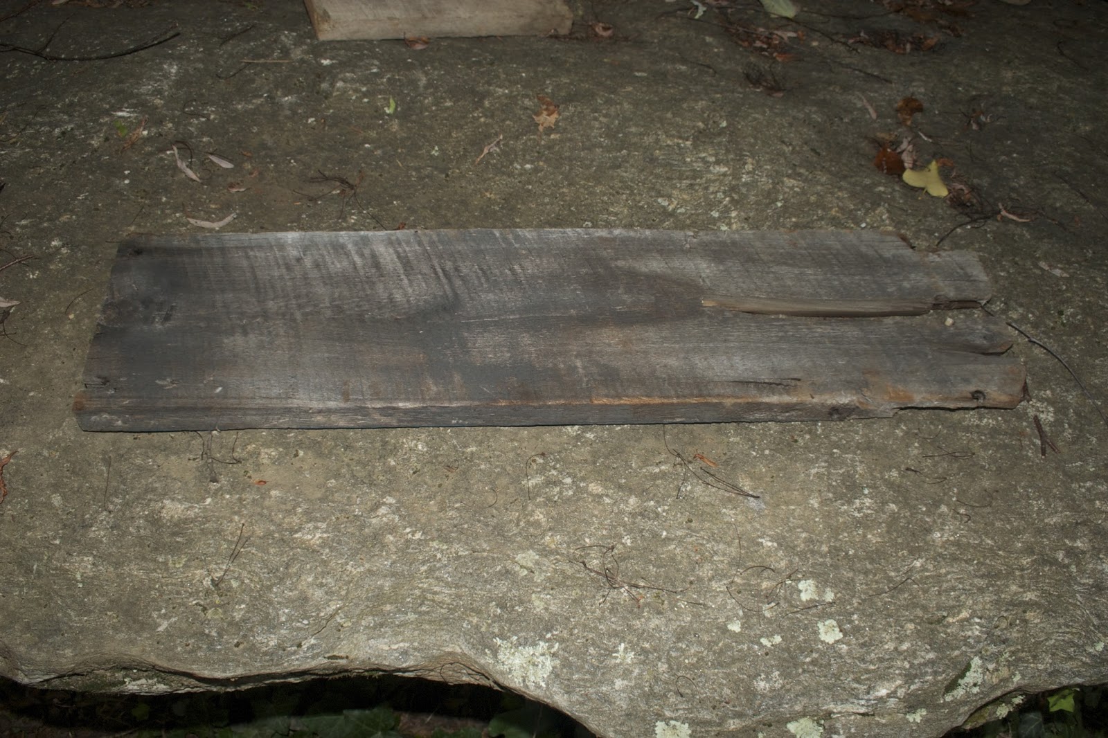
Potential Wood for New Turner Project

I am as I had stated before prospecting the possibility of working on a new Turner reinterpretation on wood. The painting to be done is called The Burning of the Houses of Lords and Commons 


This painting in particular looks like it has a very compelling history. It was not part of my original 93 because it does not belong to the Tate collection, being instead housed in Philadelphia. Gives me something to look forward to, if I'm ever in that neck of the woods.

Now I have to sample the sorts of wood available for the project

We picked way many more than were necessary, but figure a choice is a useful thing to have at times. Clearly due to the nature of the medium, the shapes are a bit weird, but there it is. I will label them all by number so they can be referred to in that way. Warning also that it tends to look pretty unappealing when it' not appropriately prepared, but that a lot of potential is available. The wood really is best when seen in person, no getting around that

1) clearly a piece of barn or something 47" x 7.5"


2. This one has a nice eye in it, as well as ragged edges 31" x 10"


3. this piece of wood has 3 nails sticking out of it! It can be removed, of course
It also has a very rough working surface - 28"x 7"


4. this one has a light blue coat on the back of it - 2 are like that, actually - 28"x 7"


5. this has a very promising shape but posibly too long - 24"x5"


6. this one has great texture, and is bowed on the other side - 29" x 7"


7. This is a very special piece of wood. It stands on its own. and is a pleasing round shape. Measurements are for biggest area - 15.5" x 13 x 5.5


8. This one is really super special - it is made of weathered plywood found in the river, which has created great shapes and colours to it. It actually has sort of a burnt appearance. At one point Jim burned a poem onto it: "Any man who hides secrets in the closet of his soul will have a basement full of terror in his psyche - to soar his life to the heights of his dreams, he must somehow set his secret free." It is very subtle and almost invisible, but it is there. 22" x 16"


9. This is a fun wedge wood - I love working with these round shapes. The dark is moisture stain as opposed to fire/charred. Still some bark attached to it. 15" x 11"


10. This one has funny fissures and is not quite flat. Also in general a smaller canvas. Fun to work with, though, probably. 17" x 6" on longest edge.


11. This is the 2nd one that has the blue paint on it. Also a fun fissure on the short side. 28" x 7"


12. This is a great one that is probably too square, but is old barn wood. 11" x 10"


13. This is another fun one that stands on its own; it also has a flame-like shape. 10" x 12" x 2"


This is the best of what we could find to be available.

Tuesday, March 13, 2012

Color Planning & Fishing

An engrossing process involves choosing colors. THus, a process has emerged for actively choosing which colours to utilize. Beforehand this was sort of an ad hoc process, and, while I admit that books & manuals exist, I've always been too rushed or lazy to study the matter - save one time I learned about a technique I have alluded to, grisaille.

What has emerged is a bit of a record of which colours used bring about which results. Ideally, in the future, a record of how I arrived at each composition will remain, allowing me to reproduce a system I liked, find a colour again which I had mixed, and get used to using more mixes in the things.

1) I sampled and numbered all my available oil paints, separated by hue - the 'yellows' from 1 to 17, the 'reds' from one to 14, etc. Whites, Reds, Blues, Yellows, Blacks, Browns.

2) Take the paper canvas sheets and label each corner with the number of the piece being worked on. Then, dab points of paint, label, and mix. Some or all of these I then use to construct the landscape.

I have found this in general a good first step when I am looking at the book, the block of wood, and find myself COMPLETELY and hopelessly stuck! It can be a double edged sword, though, when the colour mixing process becomes more engaging that the painting!

3) create general personal colour wheels - something I've not done since first year of art school. Especially when playing around with a new pigment, and wanting to see where it can go.

This is all part of my larger goal with this process, which is to develop a painterly strategy that will eliminate that weird moment of vacuum, terror, and awe that grabs the jugular every blessed time the intention to begin a painting is framed.

Now, wanted to share re. this painting:


Fishing upon the Blythe-Sand, Tide Setting In - exhibited 1809

Oil on canvas
support: 889 x 1194 mm
painting

Accepted by the nation as part of the Turner Bequest 1856

First of, a group, the Sandycombe Lodge Trust, is conserving a villa Turner apparently built himself (artist and architect as he was), allowing him to escape the big city and pursue restful hobbies such as fishing, walking and..as usual... making art:

He took his boat along the Thames, he walked the riverside and climbed Richmond Hill with its famous view along the ‘Matchless Vale’, and he drove out in his gig through what was then an area of woodland, farmland and market gardens – always sketching, sometimes painting, as he went. At Sandycombe Lodge a visitor remembered the artist standing by his drawing-room window, ‘refreshing his eye with the run of the branches’. Many of Turner’s most famous paintings date from this time, and were inspired by this Thames scenery, the Aeolian Harp ( l808) and England: Richmond Hill on the Prince Regent’s Birthday (1819) being two notable examples.

Secondly, though the painting in question does not belong to those mentioned above, it is one of the many he did portraying this activity. From the first one of his ever exhibited at the Royal Academy (shown partly finished here - since finished but not portrayed yet) onwards, fishing scenes of one sort or another play a large part of his ouvre - understandable due to the important role the sport had in his life.

JMW Turner would have felt right at home in Madison County, of course. A typical visit to local rivers and watering holes display the occasional fisher man, woman, families. The Laurel River, on the way to Hot Springs itself is one long highway of fisher people, with favoured spots demarcated by regulars with fishing canes, large canisters, and other objects.


As far as my version of 'Fishing...", something about the piece told me to use the pallete knife, as opposed to a paintbrush, to apply paint. Anyone who has ever iced a cake will know what this feels and looks like. Can't say exactly what led me to this - I know he has used it in his work, though possibly not exclusively in an entire painting - at least not during the current phase I'm covering (early 1800's). But viewing the piece let me see wide, discrete shapes among the cloud formations & a planar look to everything that led me to think "palette knife might work here". Skies are also more fun when we experiment with how to portray them. A quick application method, it does make it hard for a person to control what appears at times - plus you must really want the special texture to show up!


I had trouble finishing the water, though I knew I needed to, because I so enjoyed the look of the piece with the rough pallete application.

That's it, then. Before the week is out I hope to post photos of all completed works up to now - and possibly one more post or so. Also, please stay tuned for Rewards survey and other news from that end of things!