Wednesday, July 29, 2015

Additional and final black and white sketches

Here are simply some progress sketches of the last black and white sketch


as seen, first just the outline across the board is laid out, and then the most dramatic scene to me (the place where the flame is consuming London and sending dark stuff through the ether - early on I realized in this sketch that for some reason I cropped like an inch off the left - so I had to just go with it


The second sketch begins adding more details on the boat and in the castle - also some of the people at the end are being added


in this one I'm adding more of the people on the lower left, adding details and darkness/contrast overall to the river and to the boats in the centre - I think here's where I began with an error in the castle area - in all my sketches so far I have had trouble calibrating elements in the castle


here we see more details emerging throughout the picture, more darks & lights, etc - also the error along the castle (I keep calling it a castle but it's really the parliament building) became solidified, so I had to simply go with it, once again. This is after all the sketching phase. Also finished the people on the right.

This is technically finished, but I am not liking how there are parts of it that are too stark, so I added graphite and blended in the smoke cloud.

Overall not happy with the dark of the sky but I think it's still an improvement over the 2nd sketch I did where I overdid everything


this is how far I will take it now. As I said, the left inch is gone, the sky is to heavy, and obviously I didn't finish the right edge in a finished way, and also the Parliament needs to be improved, but as I said I feel like this is as far as it needs to go

For contrast, I am posting the previous sketch to compare:


and then the other one:


next time I will bring colour into the mix

Saturday, July 25, 2015

Some re artistic process and some re new sketch & random news

It only took me 2 weeks to put up a new sketch! Here it is, it is more black & white


the interesting thing about thsi sketch is that it is way too dark for the simple reason that I am utilizing a medium I am very unfamiliar with: watercolour pencil. I'm not that great with watercolour, period, and I used too much pigment. I mean, I was trying to go for more contrast than I did in the other sketch, but went way the other way. Also fudged the proportions a bit, but thats what this process is for. to get all the bad ideas out of the way!

One reason for my delay in painting is purely practical: I am still needing to find my art supplies from the time of the fire. After we signed the lease thru March on our new dwelling, we have had to spend an inordinate amount of time dealing with our stuff in storage, and the main issue has been, where are my paints? I have basically $1,000 worth of art supplies (esp. for oil and wood prep) in the storage unit, and I've been waiting to find them. Meanwhile I purchased these nice pencils.

The next step in terms of art process is to add colour. THat's what we use the pencils for as well. I am to make one or two more black and white, one or 2 more colour, and by then I trust we will have moved on to the 3rd step which will be painting on the wood panel itself. Jim prep process will be part of that as well as, most importantly, finding the paints.

By then the sketching will have taken me to the place I want to be, which is similar to the place that a musician or an actor wants to be when they are finally at curtain time, after having rehearsed for ages. I come from a primarily musical background, transitioning towards art in high school. What I have gotten from the musical process is a multi sketch method whereby I rehearse in advance what I want to lay out - different ideas, different force, different perspectives, or proportions, even, and then the final result is supposed to be the best characterization of all those things.

which of these boxes contains my paints?
The storage business gives me a reason to be forced to stay away from painting so soon.

THe summer allows for sketching in nature, suck as this video indicates:


This other video, taken near the Pigeon River in a lovely watering hole, shows Jim's wood gathering process, something else that occurs on these walks, making them both a huge part of myTurner art process and the Marshll Arts process I had described in the past.


Sadly, not all works out so well, and yesterday, this happened at most an hour after the above reasonably happy videos:
As can be seen from the above videos, the place is lovely but there's lots of room for error. In ten years running around through the Western North Carolina woods, this is the first time this happens to me. I fell bizarrely as I was hopping from rock to rock and slipped on one that was more wet than it appeared.

So if this post sounds disjointed and weird, it is because I am suffering physically and to an extent mentally due to the lack of caffeine since I hear that helps the fractured bone process.

Not for that do I believe that the painting project is compromised - blessedly it is a small canvas.

Hope all can manage to stay safe!

Friday, July 10, 2015

travelling & initial sketch

I just wanted to share an update re/ the awesome painting project I have received. One reason I had waited till now to do this was typical holiday things, where we ended up going to many lovely places:

Blue Ridge Parkway!
We have been camping for the 4th of July and other occassions, taking advantage of the lovely summer, and the fact that all the art selling from the past 3 years, which we have now transitioned out of, has ceased, allowing us to travel again and enjoy the nature which in large part inspired the Turner Project to begin with.


This inspiring vista comes from Whitewater Falls at Nantahala National Forest, on the edge of Jackson and Transylvania Counties. 

The place Jim's standing on top of in this picture is the very very top of this amazing place: 
via Jordan Luff on Facebook

But now, it is time to work, especially since I will finally have access to my painting supplies in about a week! Am very excited yet trepidations to unpack all our stuff from the fire storage unit where our things have been hiding for a long while.

In any event, here is an initial sketch - I will do a number of these in differing media so that I can feel confident re. technique and so that then I can focus on creating as expressive and overall awesome piece as I can.

The initial sketch phase is black and white, so as to get tonalities. What you do there is look at different parts of the painting as discrete shapes and blobs, and you sort of make yourself lose sight of a bridge, a flame, water, etc. You do this so that

a) you don't get stuck playing a proportions game you can never win
b) you do it so as to begin to approach a sense of 3 dimensionality - sometimes hard to achieve when you are working from a flat 2D surface as opposed to plein air
c) you want to aid your colour mixture when the time comes to add it in by working out values & hues independently of
d) it's a warm up! very necessary
e) it allows a different more creative way of looking at things

So here it is, and I think it went quite well - I succeeded in doing it in one sitting:

so here I can see what works, what needs help, etc.

I plan to do at least one more black white, and then colour like this in pencil with a pad before the time comes to really do it.

I am very excited to have a chance to be this methodical about it! The 90 Days project was so very fast that I had no time to really sit with a piece, get to know it, read up on it, etc. This allows a vertical v. horizontal immersion in the Realm of Turner.

Saturday, June 20, 2015

Official! Painting Commission - The Burning of the Houses of Lords and Commons

I am very happy to say I have received a painting commission!

It will be the Burning of the Houses of Lords and Commons, which is this painting:


on this piece of wood:


As can be seen, the canvas presents some interesting challenges in terms of execution: the 'canvas' has a few fissures, including one that's 2 or 3 inches long. As well, the surface is not even - creating a lot of interesting texture that can be an obstacle when a lot of detail is involved. Thankfully, this particular painting is not as heavy on details as many others of Turner's, such as the Battle of Trafalgar:


my version Battle of Trafalgar on old barn door

The commission is a housewarming gift for a woman who is a great Turner scholar and talented painter in her own right. She has this to say about the Burning of the Houses of Lords and Commons:

"Turner has a unique way of capturing how lovely a fire can be. He always has signature bands of smoke and long streams of light that create amazing colors and movement! '"
A great way to see this is not only from the painting itself, but from many of the watercolour studies for this painting and other fires that Turner created, and which live at the Tate:

 From Turner catalog:

"The present Tower study is notable in being the only one of the nine to incorporate gouache: a touch of white is combined with scratching out to render a bright light through a window of the towers silhouetted towards the left. This may be an effect Turner observed or imagined, or perhaps the report caught his attention."


 From Tate catalog:

"This one of the most atmospheric and least detailed of the studies, but there are slight indications of the cuboid, turreted form of the White Tower to the right of the centre, suggesting that the view is from the north-east.
Addressing the sequence of studies in the context of the traditional former 1834 identification, Katherine Solender felt that the ‘fluid colours’ of this work, D24849 and D27852 ‘suggest burning architectural forms within an atmospheric setting, but these cannot be related to the fire at Westminster with any certainty’
From Tate catalog:

"Addressing the sequence of studies in the context of the traditional former 1834 identification, Katherine Solender felt that the ‘fluid colours’ of this work, D27848 and D27852 ‘suggest burning architectural forms within an atmospheric setting, but these cannot be related to the fire at Westminster with any certainty’.1 " 

From Tate website: 

"Here Turner appears to represent the roof and clock tower of the storehouse relatively intact, with crowds picked out at the edge of the moat at the lower left. The roof and clock tower fell at an early stage, and this study is possibly a fanciful view of the fire at the point when it was spreading from the Bowyer Tower, where it broke out, to the roof. On the left in the distance appear to be buildings on the near side of St Katharine Docks to the south-east." 

 From Tate website: 
Addressing the subject in the context of the traditional former 1834 identification, Katherine Solender nevertheless noted that this and another of the studies (D27846) ‘contain shapes alluding to classical architecture’, with ‘suggestions of columns and entablatures more closely resembling Greco-Roman structures than the British Houses of Parliament’,1 comparing them to the Turner watercolour, probably of the middle 1830s, known as The Burning of Rome (Tate D36232; Turner Bequest CCCLXIV 370), inferring the possibility of an ‘allegory’ of political decay.2 The close-set vertical features seem rather to be the narrow brick walls between the Grand Storehouse’s tall windows, with the pattern of alternating fire and brickwork repeated as reflections below. In his extended catalogue entry for Turner’s painting The Burning of the House of Lords and Commons, 16th October, 1834, exhibited at the British Institution in 1835 (Philadelphia Museum of Art),3 Richard Dorment presented a sustained interpretation of the this and the other eight watercolour studies in terms of a sequence reflecting the topography and chronology of the 1834 Westminster fire; he noted crowds watching along the bank.4
Fire at the Grand Storehouse of the Tower of London 1841 Watercolour on paper
 From the Tate website: 
This watercolour study was originally one of nine consecutive leaves (D27846–D27854; Turner Bequest CCLXXXIII 1–9) in a sketchbook. They have previously been documented with varying degrees of certainty as showing the 1834 fire at the Houses of Parliament beside the River Thames in central London, but are here identified as representing the similarly large and dramatic fire which broke out at the moated Tower of London on 30 October 1841, destroying the late seventeenth-century Grand Storehouse (see the Introduction to the sketchbook for detailed discussion). This is one of the least architecturally defined studies, but the White Tower may be shown just to the right of the fire, south of the incandescent Grand Storehouse, and there seems to be a hint of pale buildings receding beyond the moat to the south-east on the left. Compare the equally elemental treatment in D27853.


 From Turner CATALOG site: 

"Here, the tall windows of the Grand Storehouse are lit by the fire within, and are shown from the north-west across beyond the moat and the dark masses of the outer defences. The composition is comparable with that of Destruction of the Small Armoury in the Tower of London, on the Night of 30th Oct., 1841, a lithograph after William Collingwood Smith (1815–1887) published on 8 November 1841, and the similar view in Destructive Fire at the Tower of London. October 30th 1841, a colour lithograph after J.L. Marks, a more graphic, unsophisticated rendering, enlivened by agitated crowds and galloping horses (see the Introduction for other comparisons between Turner’s studies and contemporary prints)."


The Burning of the Houses of Parliament c.1834–5 Watercolour and gouache on paper
The Turner catalog does not go into detail about the above sketch, which is a pity, because it looks just fascinating. The gouache adds a remarkable amount of white detail. In particular I love the dark masses on the top left and the bottom right. The crowds and details of the building are very apparent. A wonderful textured layered effect is apparent everywhere.

What I saw above demonstrates the way he can accomplish such luminosity, even with watercolours that did not use gouache. One obvious way of accomplishing this was through adding that remarkably heavy, dense dark blues and greys so that the areas he left white or washed over with yellow really stand out. This was occurring in all these sketches, but in particular the last two I posted really demonstrate this to me. Many more sketches, some just in charcoal, exist on the Tate website and I may have occasion to discuss them later.

This will be the first time in three years that I get to work on one of these delightful Turner works on wood, so I am supremely excited. The nice part of this one is, since I will only have one to work on, and a few weeks to prepare it, so I will have some time to really plan it well. I may succeed in achieving a depth of process that was only approximated when I was needing to churn them out within a 10 or 15 hour period! Hopefully I will not be working on it at the dead of night!


Monday, June 15, 2015

Potential Wood for New Turner Project

I am as I had stated before prospecting the possibility of working on a new Turner reinterpretation on wood. The painting to be done is called The Burning of the Houses of Lords and Commons 


This painting in particular looks like it has a very compelling history. It was not part of my original 93 because it does not belong to the Tate collection, being instead housed in Philadelphia. Gives me something to look forward to, if I'm ever in that neck of the woods.

Now I have to sample the sorts of wood available for the project

We picked way many more than were necessary, but figure a choice is a useful thing to have at times. Clearly due to the nature of the medium, the shapes are a bit weird, but there it is. I will label them all by number so they can be referred to in that way. Warning also that it tends to look pretty unappealing when it' not appropriately prepared, but that a lot of potential is available. The wood really is best when seen in person, no getting around that

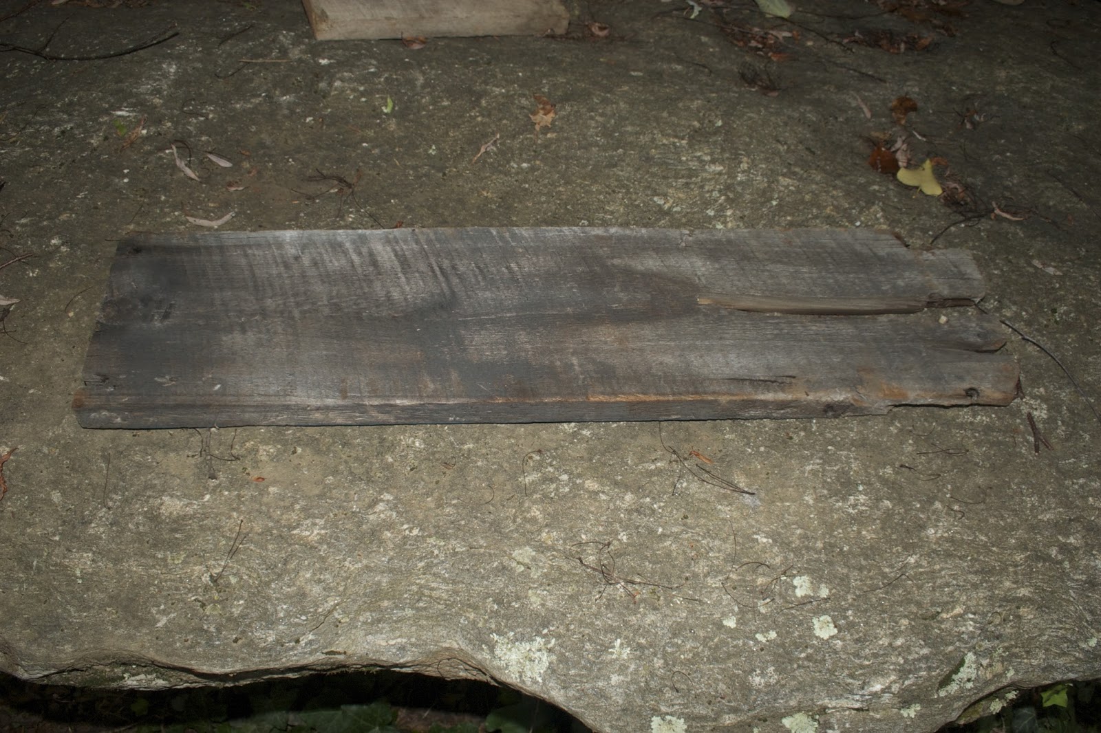
1) clearly a piece of barn or something 47" x 7.5"


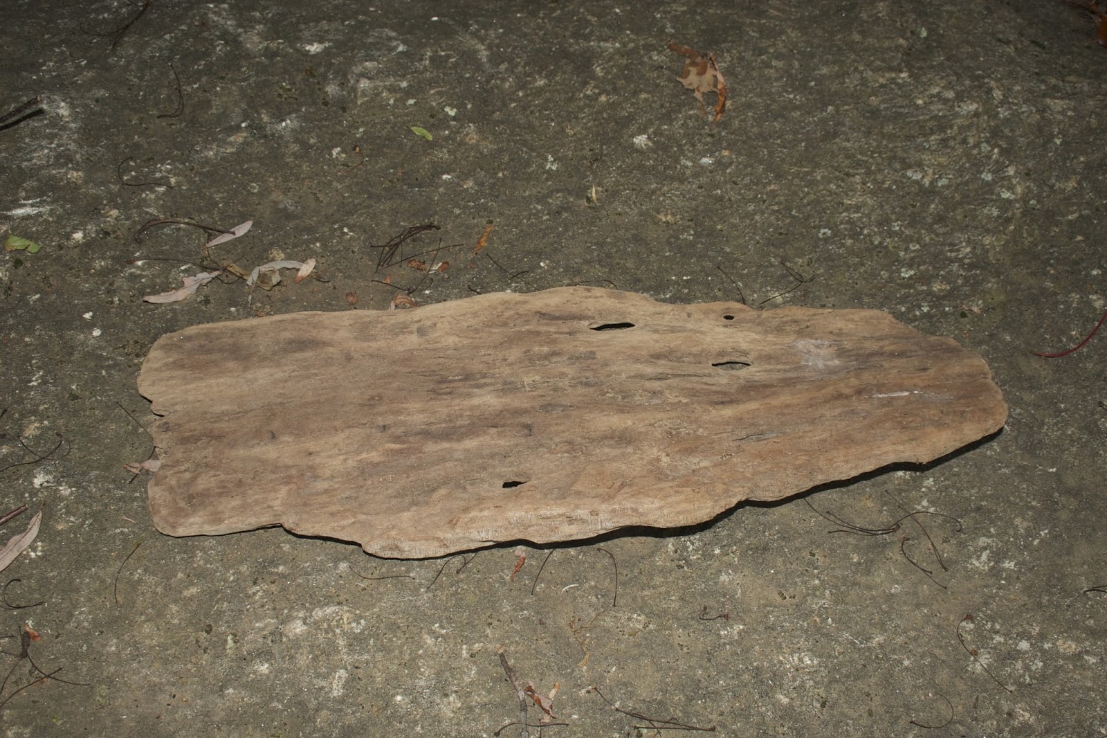
2. This one has a nice eye in it, as well as ragged edges 31" x 10"


3. this piece of wood has 3 nails sticking out of it! It can be removed, of course
It also has a very rough working surface - 28"x 7"


4. this one has a light blue coat on the back of it - 2 are like that, actually - 28"x 7"


5. this has a very promising shape but posibly too long - 24"x5"


6. this one has great texture, and is bowed on the other side - 29" x 7"


7. This is a very special piece of wood. It stands on its own. and is a pleasing round shape. Measurements are for biggest area - 15.5" x 13 x 5.5


8. This one is really super special - it is made of weathered plywood found in the river, which has created great shapes and colours to it. It actually has sort of a burnt appearance. At one point Jim burned a poem onto it: "Any man who hides secrets in the closet of his soul will have a basement full of terror in his psyche - to soar his life to the heights of his dreams, he must somehow set his secret free." It is very subtle and almost invisible, but it is there. 22" x 16"


9. This is a fun wedge wood - I love working with these round shapes. The dark is moisture stain as opposed to fire/charred. Still some bark attached to it. 15" x 11"


10. This one has funny fissures and is not quite flat. Also in general a smaller canvas. Fun to work with, though, probably. 17" x 6" on longest edge.


11. This is the 2nd one that has the blue paint on it. Also a fun fissure on the short side. 28" x 7"


12. This is a great one that is probably too square, but is old barn wood. 11" x 10"


13. This is another fun one that stands on its own; it also has a flame-like shape. 10" x 12" x 2"


This is the best of what we could find to be available.